Branding
Branding & Logos


Brand Style Guide
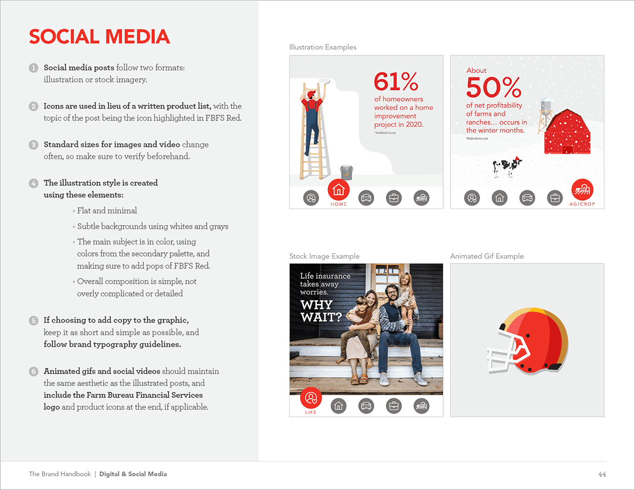
These are a few various pages from the comprehensive brand guidelines I developed for Farm Bureau Financial Services.
I revisited the secondary colors so they complimented the primary red better, as well as created an illustration style to maintain consistency across digital marketing.

B2B Social Platform Logo
Logo developed for a social media platform for insurance agents.
The goal was to family with the Farm Bureau Financial Services brand, while having its own identity. I wanted to create an identity that could also be abbreviated down to an icon to capture the idea behind social media profile images. I used a similar color palette to family with the insurance company.

Hand Lettered Logo
I developed a custom hand lettered logo and color palette for a local photographer’s website.
The goal was to create an identity that was clean and friendly, but also personality. To meet this I maintained mostly the same line weight, leaving some imperfections to leave some hand drawn element to it. I also created soft curves and added unique flourishes to the k, l and y.

Church Logo
I volunteered to design a new logo pro-bono for a local church.
The goal was develop an identity that was inviting and modern. The “CC” in “LCC” stands “Christian Center,” and the “L” stands for “La Iglesia Del Senor” or “The House of the Lord.” To represent this, I created 3 towers (representing the Holy Trinity) and formed them in the shape of a building to represent the “house.” Finally, I added the bottom swoosh to create a solid foundation but to also add movement.

Nonprofit Program Logo
I volunteered to design a logo pro-bono for All Hands and Hearts, a volunteer-powered nonprofit that addresses the needs of communities impacted by disasters. Education for All is a special side-project of the non-profit dedicated to building disaster-resilient schools around the world.
The goal was to create an identity to match the All Hands and Hearts identity. They especially wanted to maintain the heart within the logo. Since the focus of the program is to build schools, I wanted the logo to represent the idea of school structure, but with something to feel elementary. To do this, I used simple shapes to create a building within a heart.

Hand Lettered Logo
This hand lettered logo was created for a jeweler.
The goal was to develop an identity that was clean and elegant. To meet this, I used a brush-stroke style to lettering with added flourishes. The t was also separated for use as an icon.

Logo & Pattern
This logo was created as an updated version of their old logo. The owner only had serif type on their building sign, but no digital logo available.
The goal was to develop an identity that would elevate the brand without breaking away from the look of the type that the local community recognized. I met this by finding a similar typeface with a slightly cleaner look, and creating some movement by adding an arc. I added a trumpet icon for visual emphasis, and used it as a design element to create a pattern for the brand.

Women's Care of Wisconsin Logo
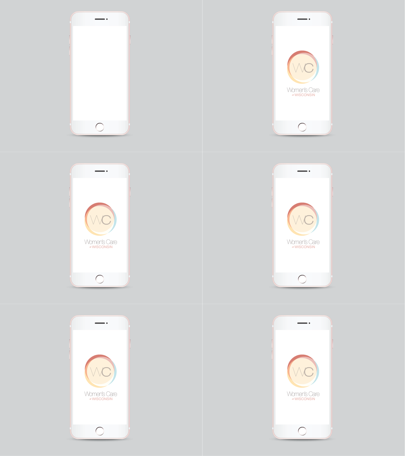
This animated logo was created for a women-centric healthcare provider.
The goal was to create an identity that was modern and warm. The clinic has the slogan “our circle of care.” I used the idea of a circle, with layers of color to represent the many layers and types of care you receive when you visit the clinic. I used various warm colors with a splash of cool for balance.
